As the COVID-19 pandemic took hold in Australia, I was surprised to see panic buying and the rise of anti-science and conspiracy theories. While puzzling at the time, I now believe that these phenomena were (and are) expressions of the need to maintain a sense of control when confronted with a seemingly chaotic and incomprehensible world.
As a technologist working in the AWS cloud, my way to create a sense of order is to build something that helps me organise and make sense of new data. Instead of conspiracy theories, I use frameworks and guardrails and best practice to tame the chaos.
By its nature, a pandemic relates to place, so as an ex-developer with a background in geospatial apps I thought it might be useful if there were a way to correlate an individual’s location data with available case data, thus allowing them to assess their exposure risk. I knew many people would have access to some kind of location history data as we all carry a GPS around in our pockets these days, so all I had to do was bring the two together.
Thus “Contact Map” was born.
I’d like to acknowledge that AWS helped me build Contact Map by providing credits for the AWS services used to make and run it. You can read more about how Amazon is responding to the COVID-19 crisis here.
The most accessible location data people were likely to have was courtesy of Google. If you log into Google’s services on your phone there’s a good chance they have a scarily accurate log of where you’ve been — go here and find out (but make sure you uncheck everything except location history before you hit Next).
The COVID-19 data hunt
Unfortunately, the COVID-19 case data was much harder to find in a consistent format. Some states offered only a single number for active cases in their whole state. Others broke it down by local government areas (LGAs). Queensland grouped cases by hospital administrative areas. NSW grouped cases by postcode — this was the most precise data I was going to get.
Most states offered no API for making data available, so if you wanted it you had to scrape it off their web sites or reverse-engineer their page to find the data urls. The Victorian government offered a clunky Power BI app which made this difficult and most states seemed only interested in reporting the cases up to the current day. Again NSW performed best, with a data API available and data in a format that allowed cases to be tracked over time.
In addition, names for regions were not consistent. There were sometimes misspellings or otherwise invalid region names. Consolidating the data in a nation-wide way was a challenge.
Fortunately, the open source community was already on the case and a number of organisations had started building national data sets from the patchwork of state sources. I ended up using The Guardian’s data feeds, combined with my own scraping of the SA web site’s data and the API data from NSW.
I started fetching this data daily to build my own time series data and stored it in a PostgreSQL RDS database, chosen so I could leverage the Postgis geospatial extensions. The Contact Map database now has case data spanning several months, correlated with the correct region types and the geospatial geometry for each region.
There’s an API for that
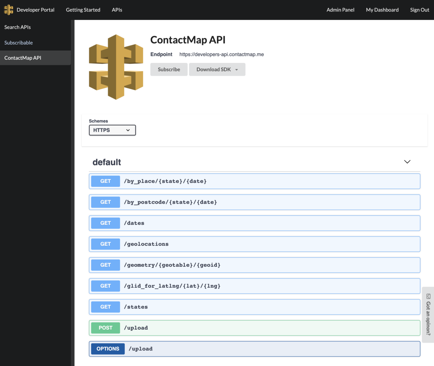
Given how difficult it had been to get the data I wanted, I decided to make my data available via an OpenAPI. I used the API Gateway Developer Portal from the AWS Serverless Application Repository to do that, which when combined with an OpenAPI/Swagger file did all the heavy lifting.

The Contact Map API offers not only the case data but also calls to get the GeoJSON for all the applicable boundaries, and it’s all free to use.
Putting the app together
Now that I had my data it was time to put the app together.
I decided to make use of the open-source AWS Amplify framework, because it would provide my app with the serverless deployment and hosting environment I wanted with the least “undifferentiated heavy lifting” on my part. It also gave me easy access to a number of AWS services that I might use in future, like user authentication.
Amplify has integrated support for Vue.js, an open-source model–view–viewmodel JavaScript framework that I had enjoyed using in the past. Getting set up was a case of following the straightforward user guide. The trickiest part for me was getting used to the changes that had been made to Vue.js since I used it last!
The end result
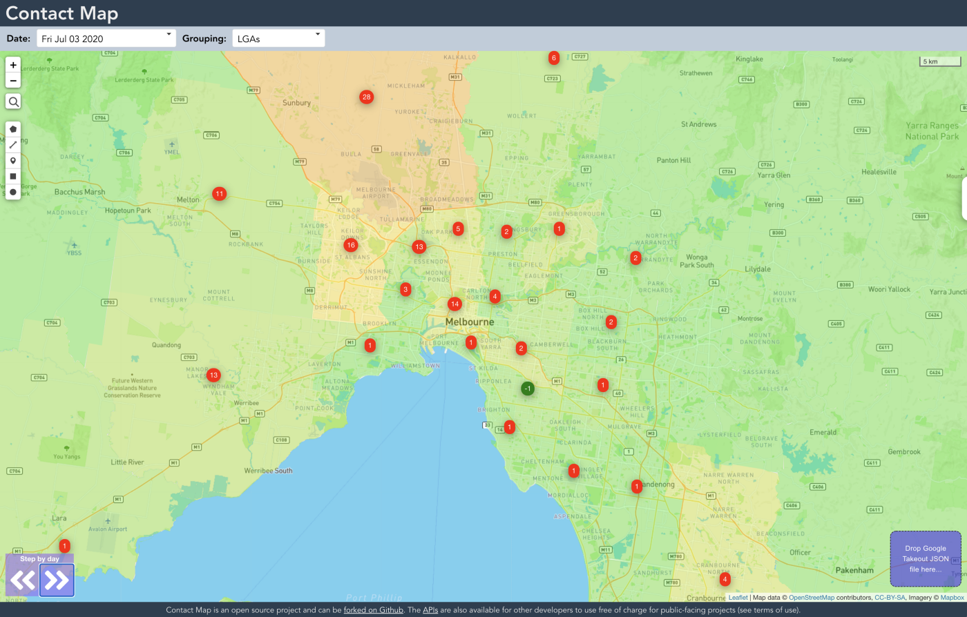
What I ended up building was a little different to what I had first imagined. I experimented with different ways to display the data and ended up settling on borderless coloured regions. The colour scheme is relative to the whole country — red is the highest and green is the lowest case count.

The map also shows a difference indicator on areas where counts have changed on the dates you’re swapping between.
My initial thought was that users would be required to log in to upload their location history data, but in reality that just created unnecessary privacy issues. I didn’t want users to think I was harvesting their data, or to even think that was possible so I made it so I had no way of identifying them in the first place.
When users upload their Google Location data to Contact Map, it’s transformed for display on Contact Map, but never stored on any servers, nor do we keep any record of it. Once they close their browser, the data is gone!
Parsing the Google location data was pretty straightforward and soon I had combined the case data over time and the user-supplied location data so users could see the two on the map together.

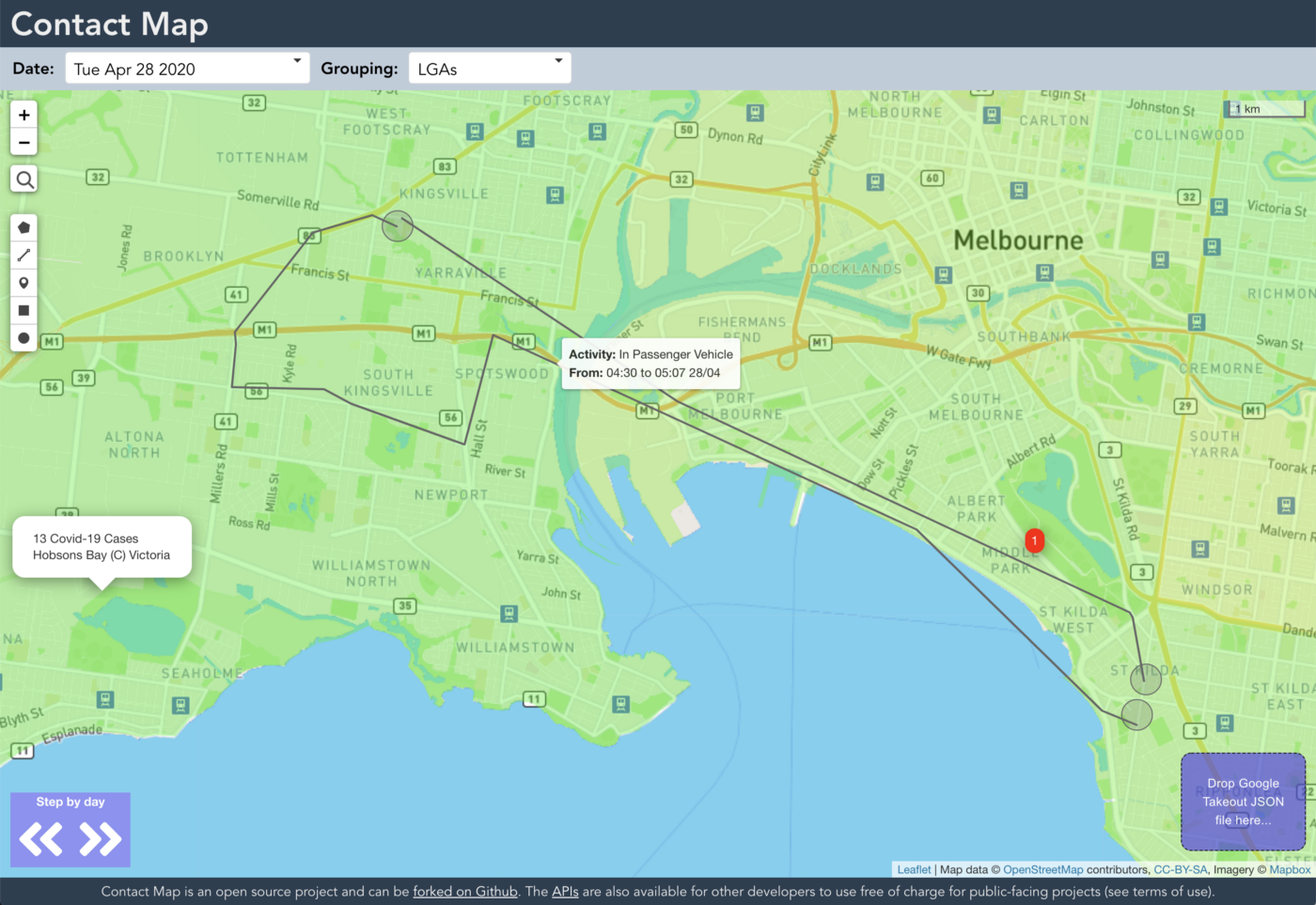
The grey circles on the map are places the user stopped at, and the lines show, approximately, how they got between places. If the user hovers over the dots and lines they see a description of that information from the Google data. The user can use controls on the map to step through the timeline in daily steps.
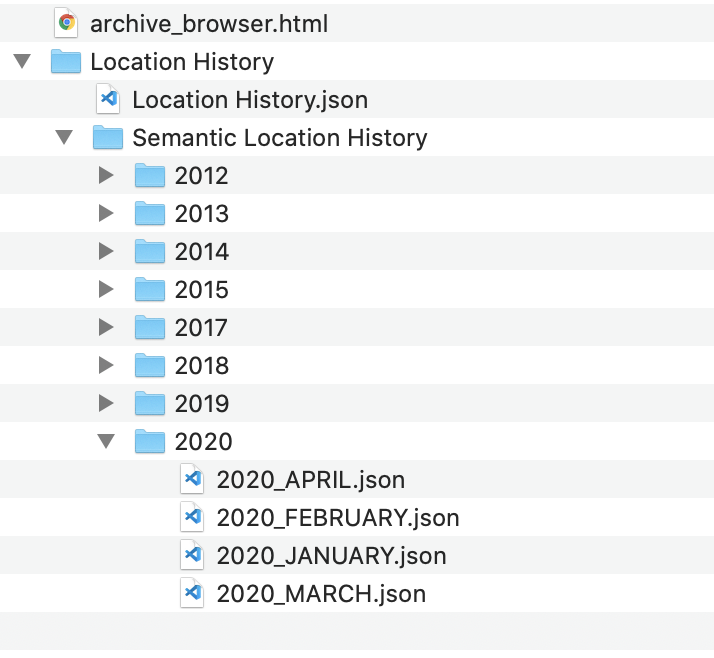
If you want to check it out, go to https://contactmap.me/. If you want to try uploading your own Google location data, the files you need are under “Semantic Location History”. Select 2020 and the month you’d like to view.

Note that Contact Map is an open source project and like all good software it has bugs! Everyone is welcome to get involved and help to improve it.
What I learned
Building Contact Map was an interesting experience. I explored some new technologies, and reacquainted myself with some I hadn’t used in a while. It reminded me too, that the challenges in the technology space are usually not caused by the technology itself but by people.
The people working in our Governments must understand the critical importance of good data, particularly in times of crisis when the community could be mobilised to help, if only they had the data they needed to do so. Good consistent data collection and Open APIs that allow that data to be consumed are the way forward, and the time to put them in place is before you really need them.
If you agree, hassle your MP!
So, can an app protect us from COVID-19?
In short, no.
Or to be more expansive, also no.
The challenge is that humans can be infectious long before they show symptoms, so unless you can track contacts between asymptomatic people 24x7 you won’t have the information you need to do the contact tracing. This of course opens up huge privacy issues.
The COVIDSafe app released by the Australian government is an object lesson in how NOT to approach the problem. Even the name establishes entirely the wrong expectation. The bluetooth proximity detection it uses has many issues that make it impractical to use and unlikely to succeed in its goal. The government has also stated they have no intention of doing the only thing with this app that might improve it, which is to incorporate the Google and Apple-supplied bluetooth proximity APIs.
I believe the best, most privacy respecting answer would be an app that users can enable that does what Google does and logs their location using GPS, but into a store that only the user themselves have access to, probably on the phone itself.
Anyone with this app running that subsequently tests positive for COVID-19 would be encouraged to anonymously upload the relevant time-series location data for their infectious period to a central data store. Users wishing to check their own exposure (perhaps having been alerted of a new case in their area) would be able to upload their own data, temporarily and anonymously like with Contact Map, to be compared to the locations and times of confirmed cases.
For those who have tested positive and uploaded their data, privacy could be enhanced by deleting places like the user’s home or work locations, as it is reasonable to expect that visitors to these places would have been made aware of their exposure by other means.
Such a system should be sufficiently accurate to provide a strong indication as to whether or not someone should get a test. It’d be easy to use (just open the app and put it in the background) and wouldn’t require the central collection and storage of personal data from anyone who has not tested positive.
For such an app to succeed of course, it would need to be supplied and managed by a trusted organisation with a reputation for technical competence and a respect for privacy. Could the Australian government pull that off?
Give me your answers or other suggestions in a comment!
Credits
Thanks to all the citizen scientists, developers and statistics whiz-kids who have swung into action to make COVID-19 data more available and more useful than it otherwise would have been! Here is a selection of great examples of the community filling the gaps:
- COVID-19 Case Tracker Australia - Track Coronavirus (COVID-19) cases in Australia with the latest number of confirmed, death, recovery, test cases of COVID-19.
- Guardian Australia brings together all the latest on active and daily new Covid-19 cases, as well as maps, statistics -Australia Covid-19 active cases and hotspots map: coronavirus stats, numbers and state by state.
- Coronavirus (COVID-19) in Australia | Data - Data visualisations tracking the novel coronavirus (COVID-19) in Australia. Updated frequently.
